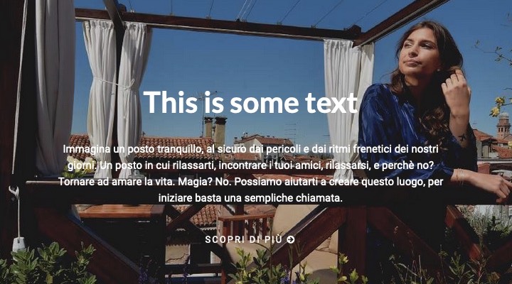
I have a hero section on my homepage that has a background image and some white text in front. By keeping the image as it is, the white text over it is almost unreadable.
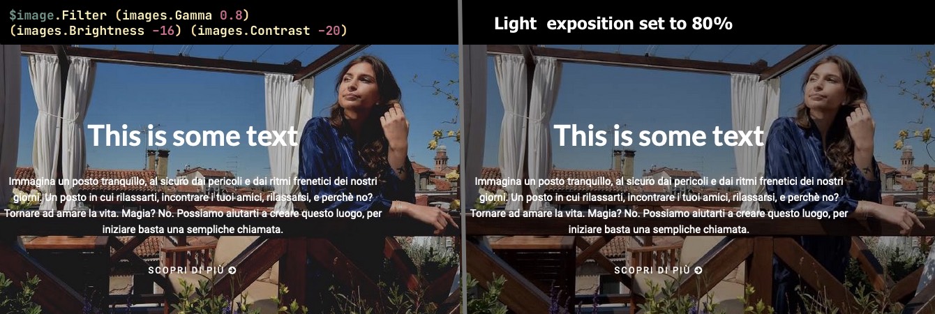
My wish was to lower the light exposition of the photo by a 20%.
Sorry, I’m not sure if this is the correct name of this effect in English… BTW just imagine to use Photoshop or any other photo manupulation tool, open the image, place over the image a new layer filled in black (#000) and set the opacity of the layer to 80%.
I did it and I obtained this:
Then I said to myself: “Why should I touch my original image, when I can have Hugo do this job for me?”. And then I started toying with the Image filters.
I tried to use some Hugo filters, especially the images.Gamma by writing this code:
Unfortunately If I try to apply a CSS filter on the <li> tag that contains the image, every nested tag inherits that rule on the brightness including the heading and the text that appears over the image:
How to apply a filter to a background image. The trick is to add some elements that get the filter. That website is bookmarkable for everything CSS related
This is not mandatory, you could just as well use an img element. There’s also the CSS property mix-blend-mode that determines how the fore- and background are blended.
Slightly OT, you might consider cleaning up the markup: li - div - div - div - div - div - h2 looks a bit over-engineered to me. Using a div with display: flex might be cleaner. Or <div><img/><div><h2></h2><p></p></div></div>, where the inner div containing the text has a transparent background and is positioned absolutely. In any case, I’d not put styles inside the template.
Thank you. This is also a great advice: As you suggested I could apply a double background via CSS; a solid black semi-transparent background over the other background image.
And I also see that it’s a well supported CSS feature on virtually any browser: https://caniuse.com/multibackgrounds
Realise you already have plenty of options but I’d like to add my personal take, as this type of image effect is something I’ve done a lot of!
As your image has some meaning an inline image is probably more approriate semantically than using the background-image property, as it is not purely decorative. Beyond that an inline image would be better for performance, better for SEO and better for accessibility. This article gives some detailed info on that: https://nystudio107.com/blog/the-css-background-image-property-as-an-anti-pattern
CSS filters are bad for performance and should be considered one of the most ‘expensive’ properties in terms of the cost to cpu utilisation and power consumption, they increase the ‘paint’ time for the browser. Avoid if you care about performance!
Personally, I would create a psuedo element with a solid colour and a reduced opacity and apply that to an element containing the image, as you can’t place a pseudo element on image.