I’m trying to get a grid layout on the homepage instead of the current stacked version. The posts should appear in a 3 column grid instead of the one on top of the other. To start with, I’ve wrapped the <article> tag in list.html in a <div class = "container">:
<div class="container">
<article class="{{ $class }}">
{{- $isHidden := (.Site.Params.cover.hidden | default .Site.Params.cover.hiddenInList)}}
{{- partial "cover.html" (dict "cxt" . "IsHome" true "isHidden" $isHidden) }}
<header class="entry-header">
<h2>
{{ .Title }}
{{- if .Draft }}<div class="entry-isdraft"><sup> [draft]</sup></div>{{- end }}
</h2>
</header>
{{- if (ne .Site.Params.hideSummary true)}}
<section class="entry-content">
<p>{{ .Summary | plainify | htmlUnescape }}...</p>
</section>
{{- end }}
<footer class="entry-footer">
{{- partial "post_meta.html" . -}}
</footer>
<a class="entry-link" aria-label="post link to {{ .Title | plainify }}" href="{{ .Permalink }}"></a>
</article>
{{- end }}
</div>
I looked through your CSS files and I can see that the cards for the posts are styled by post-entry. Combined, I’ve added this CSS to the post-entry.css:
.container {
  display: flex;
  flex-wrap: wrap;
  justify-content: space-between;
}

post-entry {
    margin-bottom: var(--gap);
    padding: var(--gap);
    background: var(--entry);
    border-radius: var(--radius);
    transition: transform .1s
    width: 32%;
    padding-bottom: 32%; /* Same as width, sets height */
    margin-bottom: 2%; /* (100-32*3)/2 */
    position: relative;
}
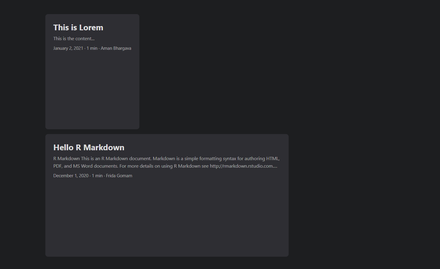
I think this is what it is supposed to be. But this clearly does not work. For some reason, the first post is reduced in width while the second post-entry is full-width. They are not side by side as expected but still stacked:
My repo is hosted here: https://github.com/thedivtagguy/archives if this is more helpful.
A live deploy is here: https://jolly-panini-82258b.netlify.app/